|
Books That Are Biased to the Left
And no, I'm not talking politics here. Rather, it is an artistic technique that is used in only about ten to fifteen percent of the book covers featured on this website.
|
||
|
I discovered this trait while putting together my three-times-per-year "Updates," when I add new cover images to the main page. I am a victim of journalism layout courses that I took way back in college (alright ... way, way back). In those dark ages, we were taught that pictures and graphics should funnel a reader's attention toward the center of a page. Images that showed action going left should be strategically placed on the right side of a page (and vice versa). And yes, I'm illustrating that ancient technique here.
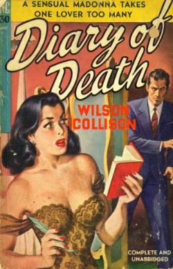
Ace S136 Ballantine 54 Novel Lib 30
In my quest for more "leftist books," I find that Gold Medal and Lion seem to have more, proportionately. Perhaps the publishers of "paperback originals" had artists that tended to be more original, too.
|
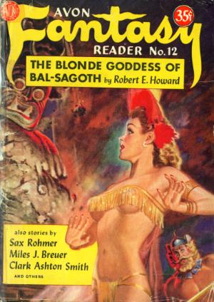
Avon Fan Reader 12 GM 296 Handi 61
So imagine my surprise to find that the VAST majority of cover paintings are designed to make the reader's attention go to the right. Even when a pretty girl is facing left, she is inevitably casting a glance in the opposite direction (like the damsel in Ace S136), causing the action to flow toward a book's edge rather than its spine. Is this a purposeful, subliminal message that the reader should open the book? Or are most artists simply right-handed? Perhaps English-speaking individuals just all think from left to right. Whatever the reason, I find myself searching harder and harder for covers that "look left."
GM 135 Lion 44 Mercury 120
|
|